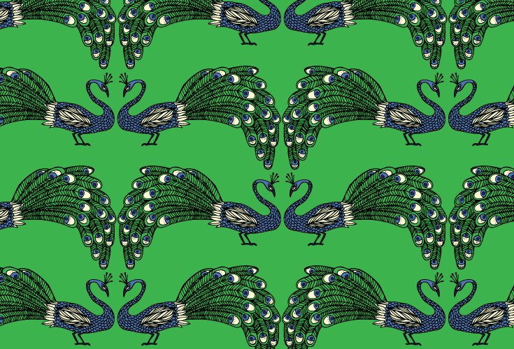
Julia Rothman graduated from the Rhode Island School of Design in 2002 and now works in her studio in Brooklyn, New York. This repeat pattern artist is very popular with well known companies and brands. A few well known companies that she works with are Target, Anthropologie, The New York Times, Crate & Barrel, Urban Outfitters, and Victoria’s Secret. Rothman is also a part of a company with two other artists, Jenny Volvovski and Matt Lamothe, creating prints, books, animations, and more. Rothman’s prints have a very fun and playful feel to them. They’re all very brightly colored have an illustrated feel to them since they consist of just outline and color, no shading or depth. The print that originally caught my eye was the gold and royal blue cheetah print on her home page. The contrasting colors look aesthetically pleasing next to each other and really makes the pattern pop. My favorite pieces done by her are in her animal prints collection, the flamingo one and the peacock one. The flamingo print is a simple, monochromatic print that has multiple flamingoes doing different things, creating a sort of movement to it. Also, flamingoes are my favorite animal. The peacock print is of two very detailed peacocks that are facing each other and then repeated throughout the entire print.

Source: http://www.juliarothman.com
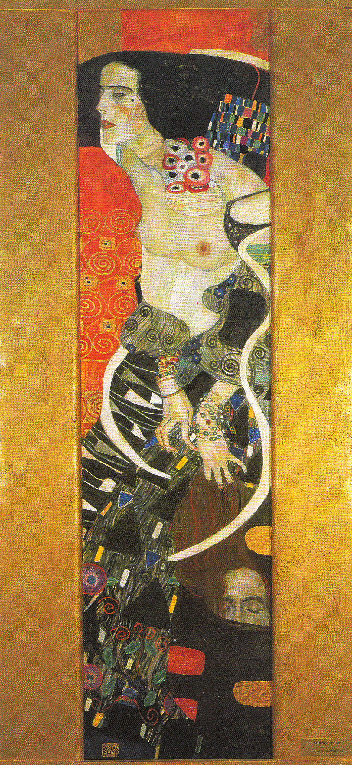
Gustav Klimt was a prominent/famous Austrian symbolist painter of the Vienna Secession. His main subject was the female body and his work is well known for its frank eroticism. His work was unpopular during his times and even considered pornographic or even disturbing to some. Klimt was born in Baumgarten, in Austria-Hungary in 1862. He attended the Vienna School of Arts and Crafts and began his career with painting large murals and ceilings of large public buildings. He also does paintings, allegories, portraits, and landscapes. Although Klimt isn’t the exact definition of a repeat pattern artist, he uses a lot of repeated shapes and colors in his work. His most recognized piece comes from his ‘Golden Phase’ called “The Kiss”, which portrays an abstract man kissing a woman’s cheek. This is one of the many paintings that got good critiques from the public eye. The main colors are golds and flowers and rectangles are repeated throughout to make shapes as a whole. One of my favorites of his is “Judith II”, which is of a nude woman surrounded by black, and also very colorful abstract shapes. She looks very powerful and content with herself, possibly distressed at the same time, which I find intriguing.
Source: https://en.wikipedia.org/wiki/Gustav_Klimt
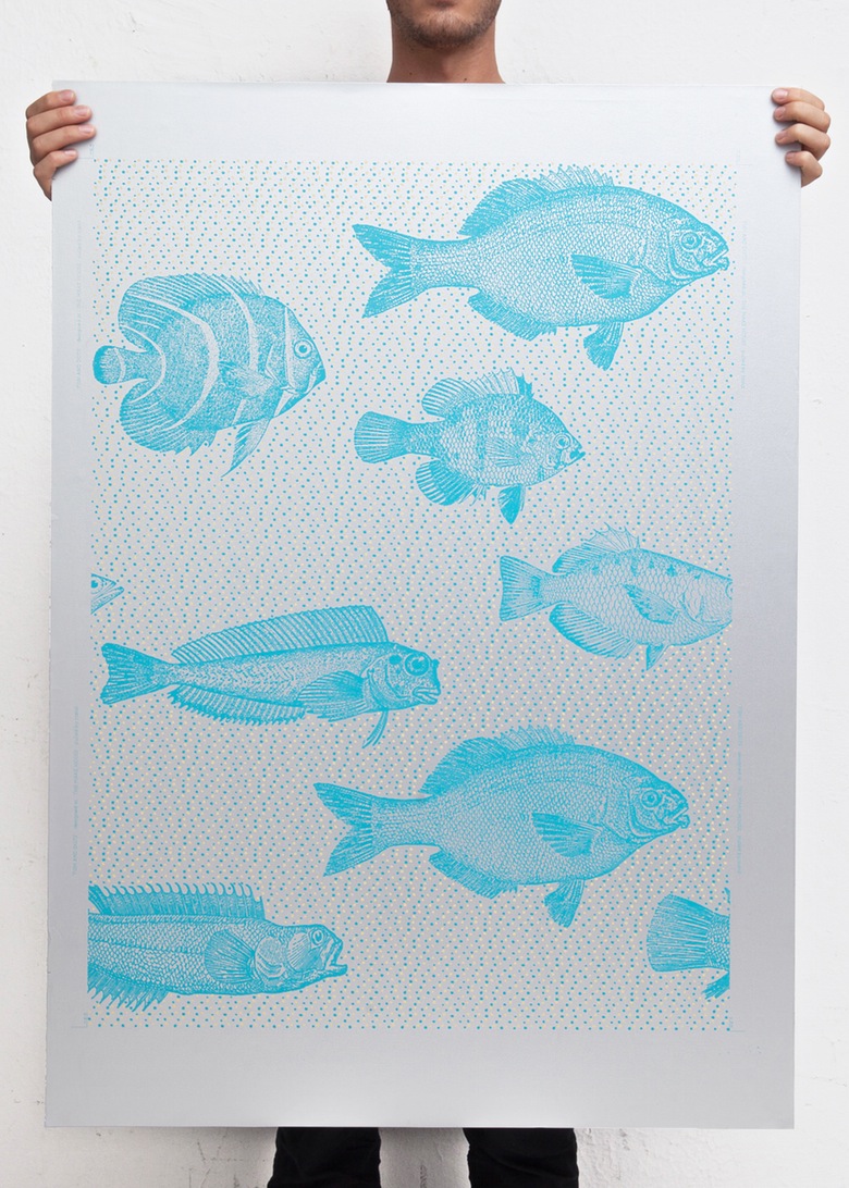
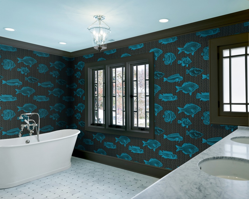
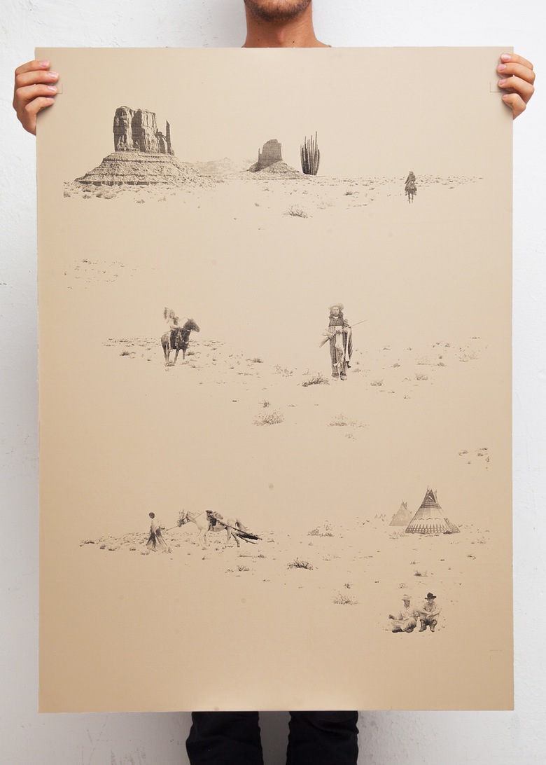
The Make House is a screen print as well as design studio in Portland, Oregon. They have multiple artists come in and work for them, coming and going as they please, but they do have a few main artists. The main artists they have that are on their website are Alexa Stark, Artcrank, and Smarsh. The Make House experience allows the public to come and see them work and understand how everything is done. Make House even offers classes to the public. They do both custom work for clients and their own creative pieces, making wallpapers, prints, and collages. The print, that also comes in the form of wallpaper, that I enjoy most is the “Fish and Dots” pattern created back in 2012. The blue pattern on the black background really stands out. It almost looks 3D/ has an x-ray look to it. They show images of it as someones bathroom wallpaper and it looks so awesome against the white marble countertops and porcelain tub. It also comes in metallic silver. Another print of theirs that I really enjoy is “Cowboys and Indians” which comes as a wallpaper in metallic gold or magnolia. It shows scenes of cowboys and indians on the desert terrain and it gives a rustic but modern feel to viewers.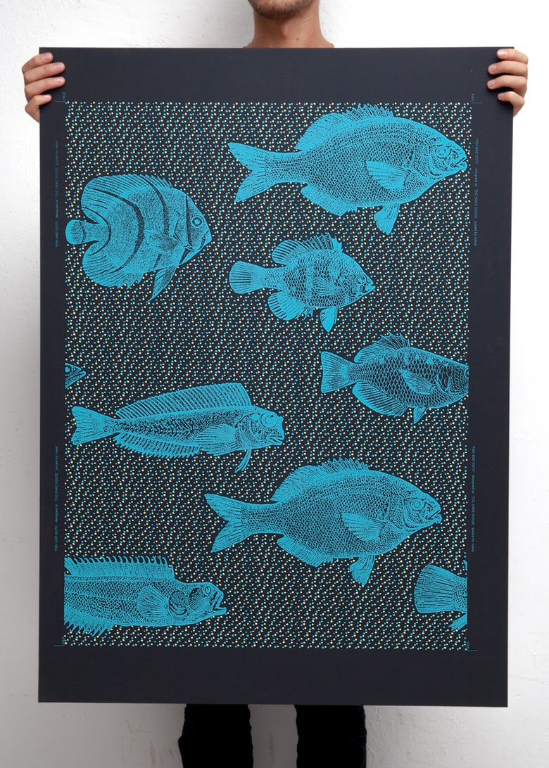

Source: http://www.themakehouse.com
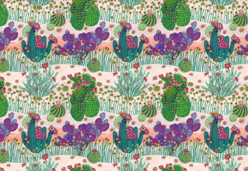
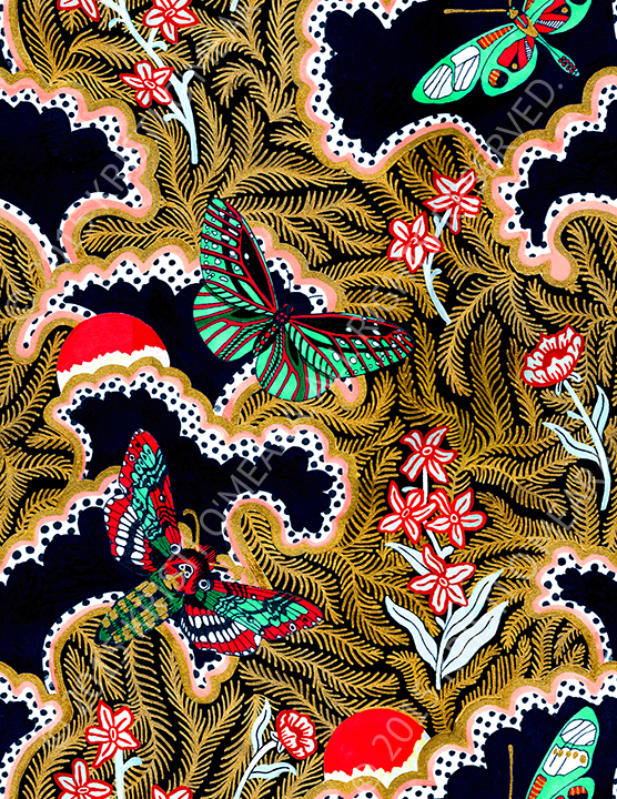
The last artist that I found to be interesting and fun is Kristi O’Meara. She does pattern designs, packaging designs, web design, paintings, illustrations, and textiles as well. She currently lives in Chicago, Illinois and is both co-founder and co-director of The Patternbase Textile Design Studio. Her work has been featured in Cool Hunting, Dutch Elle, Selvedge, NSS, and many more. I was originally drawn in by her repeat pattern “Desert Gardens” of little desert plants like cacti and flowers because of her stylization and use of colors. The pinks, purples and greens used gave it a warm and cozy, summertime feeling. I also really like her pattern called “Paradise” which has red and green moths on top of gold colored leaves and red flowers, layered on top of a black background. It also has hints of little patterns such as black and white polka dots here and there, The combination is unusual but very enjoyable. I would never have thought to combine any of these things. Her work is very unique and exciting.
Source(s): http://www.kristiomeara.com and https://www.threadless.com/designs/desert-gardens
